
Spring had been in the air in southeast Michigan for a few days before winter came back like he forgot something. Still, the spring cleaning bug had bitten me, and that extended to this blog.
A few months ago I noticed that my site name wasn’t displaying properly on desktop. Instead of saying
warped
frost
at the top, it said
war
ped
frost
Zooming out helped rearrange the letters, but I’d have to make everything illegibly small to get the name to display correctly. Deactivating my system & browser accessibility settings (which I have set to make text and my cursor bigger than the default) also didn’t help, so I concluded my site was probably displaying like that to others. How embarrassing!
I googled about this to no avail; most help out there is for WordPress dot org sites or full premium/business sites which have more control over the site design than dot com WP blogs. I figured some new feature was interfering with my theme’s code, especially since the custom font I had been using, Bree, was no longer available, and the whole theme itself, Sight, had been retired. This was what really pushed me to go ahead and change themes even though none of the free nor premium ones really grabbed me.

I ended up going with Lovecraft. I like that it’s lighter overall, and I was able to change the default color scheme to something that went better with the “frost” imagery. I wonder if there’s a way to make the featured images smaller, as it’s really overkill how big they are on desktop.
I also took this as an opportunity to redo my site logo, which I had also been thinking about for a while. My original icon was a digitally colored version of one pass of a silkscreen print I’d done in undergrad. The problem was that it was too detailed an image to work as a logo that would mostly be displaying in people’s tabs as a 16 x 16 pixel image. Alas, what I thought to replace that image with isn’t much simpler. Designing efficient logos is hard!
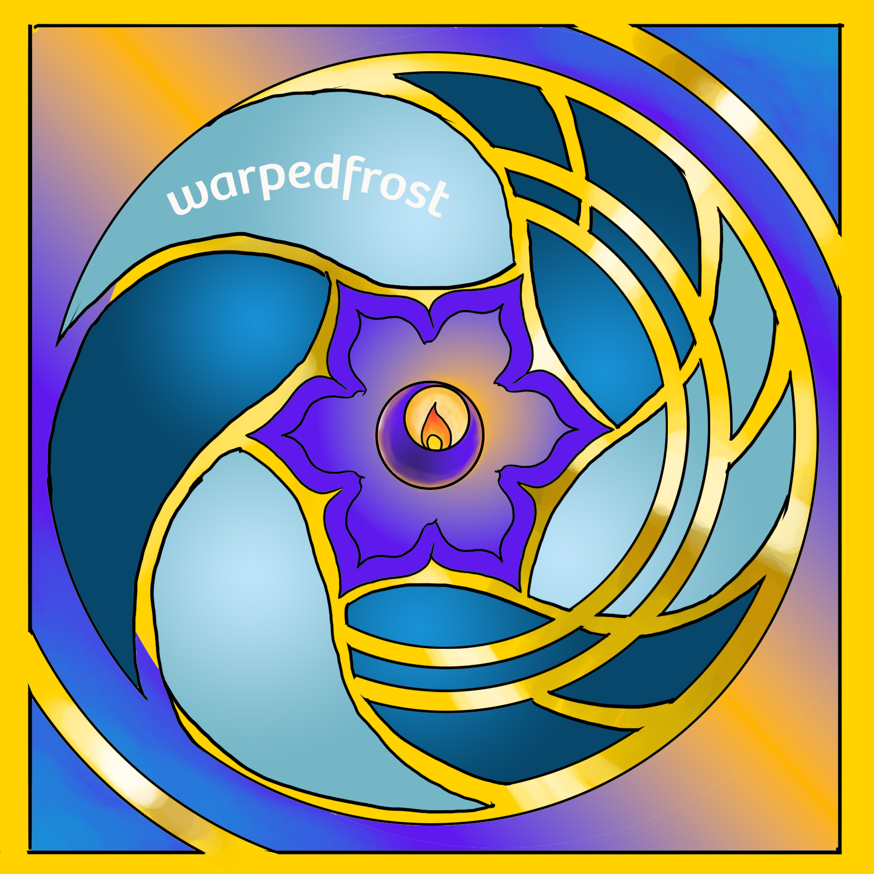
This is a digitally inked & colored version of a sketch I’d done for another print, a linocut that time. Now that I realize I have access to Bree, maybe I’ll try making something that will display a bit more clearly, maybe just a “wf” written in that font. The only problem is that my site name isn’t written in that font anymore! And it’s perhaps too close to “wtf”…yeah, come to think of it, that’s why I discarded that option last night while I was making this logo. Ahaha… Maybe I’ll come up with something when I least expect to. Until then, I guess this will be the set up of this site for a while. Let’s see if it lasts six years like the old design did.

The refresh looks great! And yeah, “wf” morphed immediately into “wtf” for me, too… 🙂
LOL Maybe I’ll just have to stick with a W, even though that’s also WordPress’s icon
where’s your sense of adventure…? 😉
Oof XD
Currently my sense of adventure discovered the Symmetry – Mandala tool in Photoshop and I’ve made a whole bunch of different snowflakes with it to try to make a logo that way.
There’s nothing quite as focused as an artist with a new tool – set an alarm to remember to eat? 🙂
LOL Trust me, my stomach does not let me forget. If I ignore it, it gives me a punishing headache.
Oh, it looks so much lighter! I like it ^^
(Hi, yes, I still come here. lol)
Thanks, and nice to see you on this side of the internet! XD