
As I was trying to come up with a new site logo that would display well on browser tabs, I came across an article in the Adobe Support Community about making snowflakes in Photoshop. You can read said article here. I ended up making twelve different designs in one sitting following the instructions in the article, then spent a couple hours more modifying and combining those designs.
I didn’t have any particular idea in mind when I started; I was really just playing with the tool and getting used to how it behaved. The Mandala symmetry setting reflects more than I was expecting, so it took me a minute to be able to predict how the movements of my stylus would translate into lines. There was also about a 1-second lag between me drawing the line and it appearing, with greater lag time for longer or more complicated strokes, so that didn’t help. Maybe if my computer were a bit more powerful the line would show up instantly?
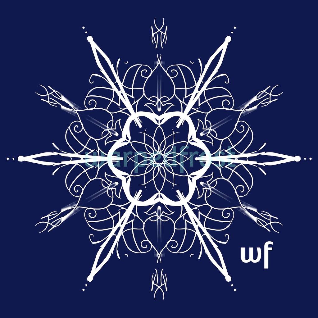
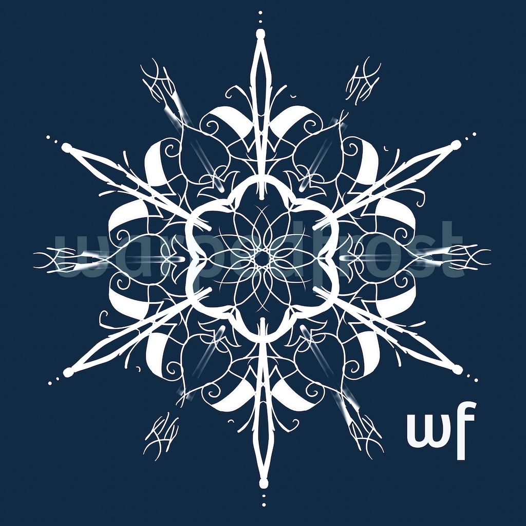
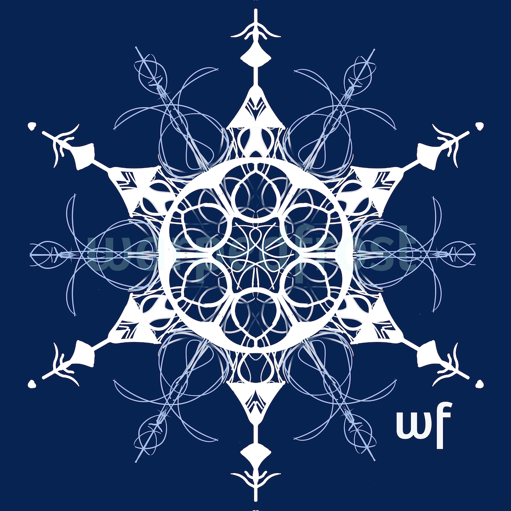
Anyway, here are the best of the original twelve designs I made. The numbers are the order that I made these in.


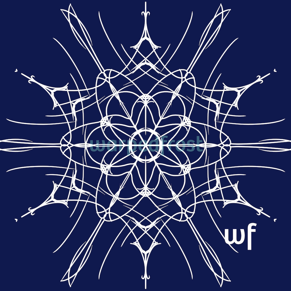


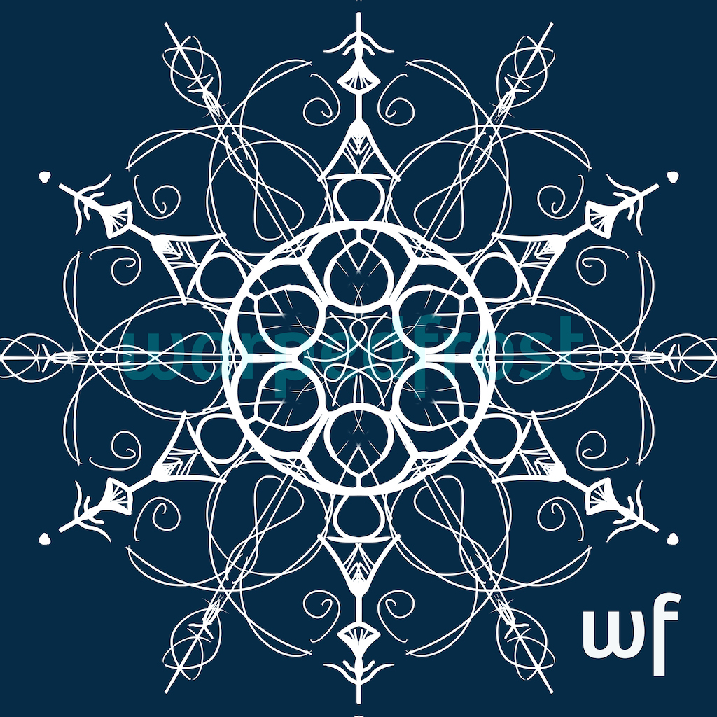
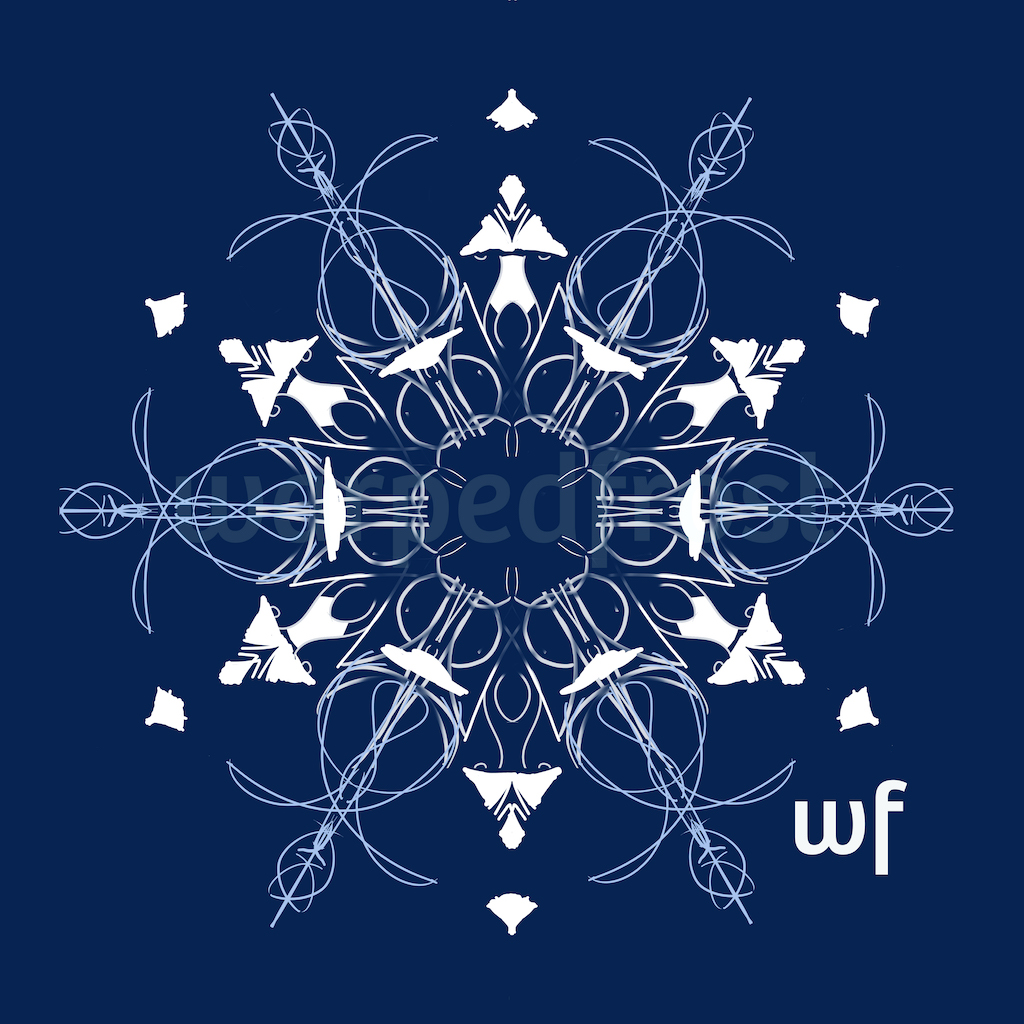
Below are the modified snowflakes. I was gonna say “Can you tell which ones are combined in each image?!” but then I remembered that the answer is in the name of each snowflake/mandala. Well, I still found it interesting to go back and forth between the originals to see what gets covered up and what gets highlighted when the designs are combined.


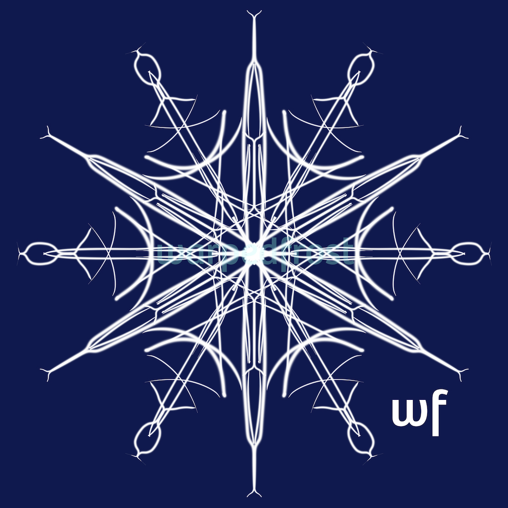
And these are some of the variations I did focusing on “Gate” after sleeping on it:
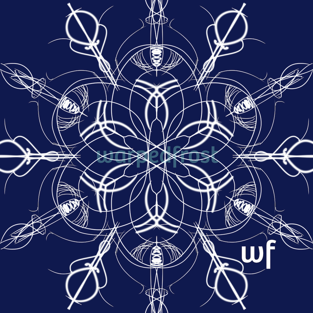
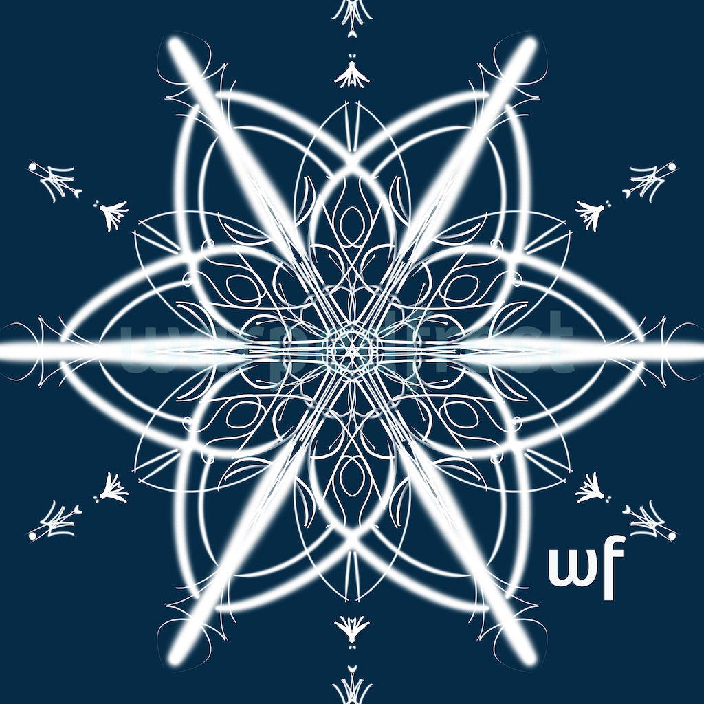
Ironically enough, this is the one that looks the best to me when scaled way down, and it’s actually the embellishment layers with what was supposed to be the main design completely hidden!

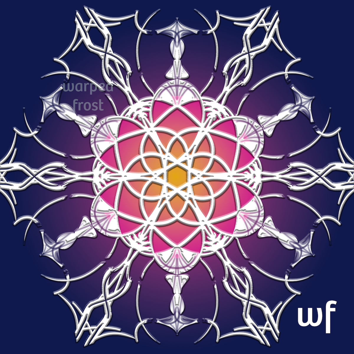
Once I had settled on a relatively simple design to use as the site logo, I felt free to make something over the top. But after looking at this for so long, duplicating layers to try different things, I slipped a little: I neglected to fill in the Y-shaped space in the bottom half of the center vertical line—something I caught just now in the course of making this post. Whoops. I kinda like it though. The design is still symmetrical vertically, but it’s not perfectly symmetrical horizontally, so it’s a slightly more dynamic design. I also like how all the imperfections in my shading were brought out by the emboss effect because that makes this look more like snow. The dark spots could be points where the snow has started to melt, or maybe where someone threw rock salt at it.
Initially, the name “Warped Frost” didn’t have any particular meaning. It literally came from a meme, one of those “use your birthday and initials to come up with your ___ name.” In this case, what you ended up with was the name of your record label. (LOL) The whole thing was “Warped Frost Sound Entertainment,” if I remember correctly. Granted, since I like winter (in theory if not always in practice) and “warp” makes me think of Star Trek, I did like the name, but the name doesn’t really describe what this blog was originally supposed to be about nor what it became. So how was I to make a logo that represented the site and the name?
For a brief moment as I made these snowflake mandalas, I thought I had come up with a good answer and was feeling mighty pleased with my pedantics (i.e. pedantic antics—I intend that pun, you Accusing Red Underline!). I thought, “The main thing on this blog now is translations, and it takes a lot of translations to make snowflakes!” But when I looked up what “translation” meant in math to be sure I had it right, Khan Academy informed me that a translation has no reflections, and there went my cute explanation in a puff of high school geometry. Oh well.
I still like it, and hope you will have fun making snowflakes in springtime, O Readers, if the spirit so moves you.

Oh that looks fun!
The thing with logos is that you need to check if they still work when they’re tiny and if they still work when transferring them to a black and white (or grey scale) format.
Yup, I kept shrinking these down to 2% in Photoshop since that’s the size they would be in tabs, at least on desktop. The ones with many colors and low contrast were for fun only. ^o^