
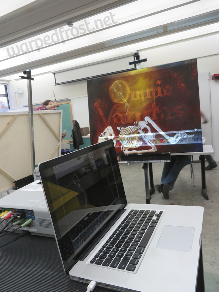
The fall term has begun, signaling the start of my second year as a part-time Art Education grad student. Last fall I had one painting class, but the first painting I set out to do ended up taking nearly the whole entire term to paint. Mostly because I picked a difficult subject and restarted several times, but also because I was working two jobs and didn’t have much time to paint outside of classroom studio time (which has never been enough for me). All the energy I put into it paid off though, as it came out fairly well.
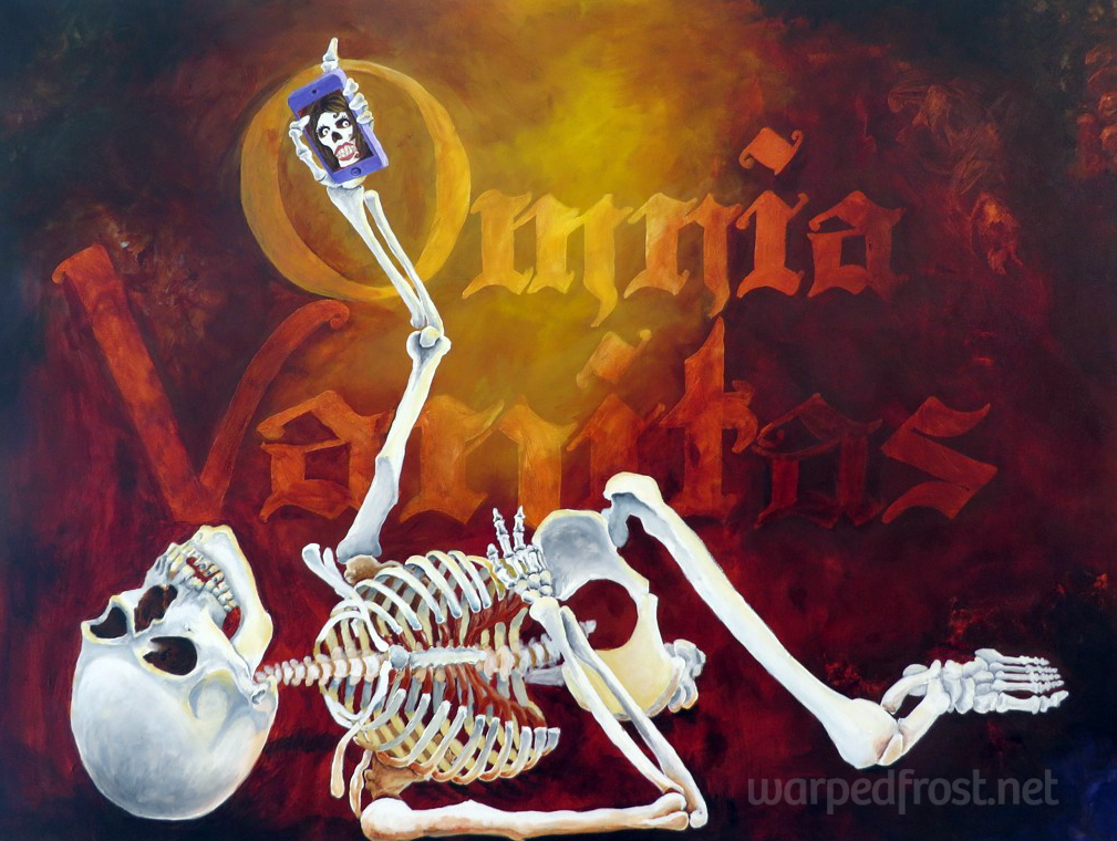
The title, as you may have guessed, is Omnia Vanitas.
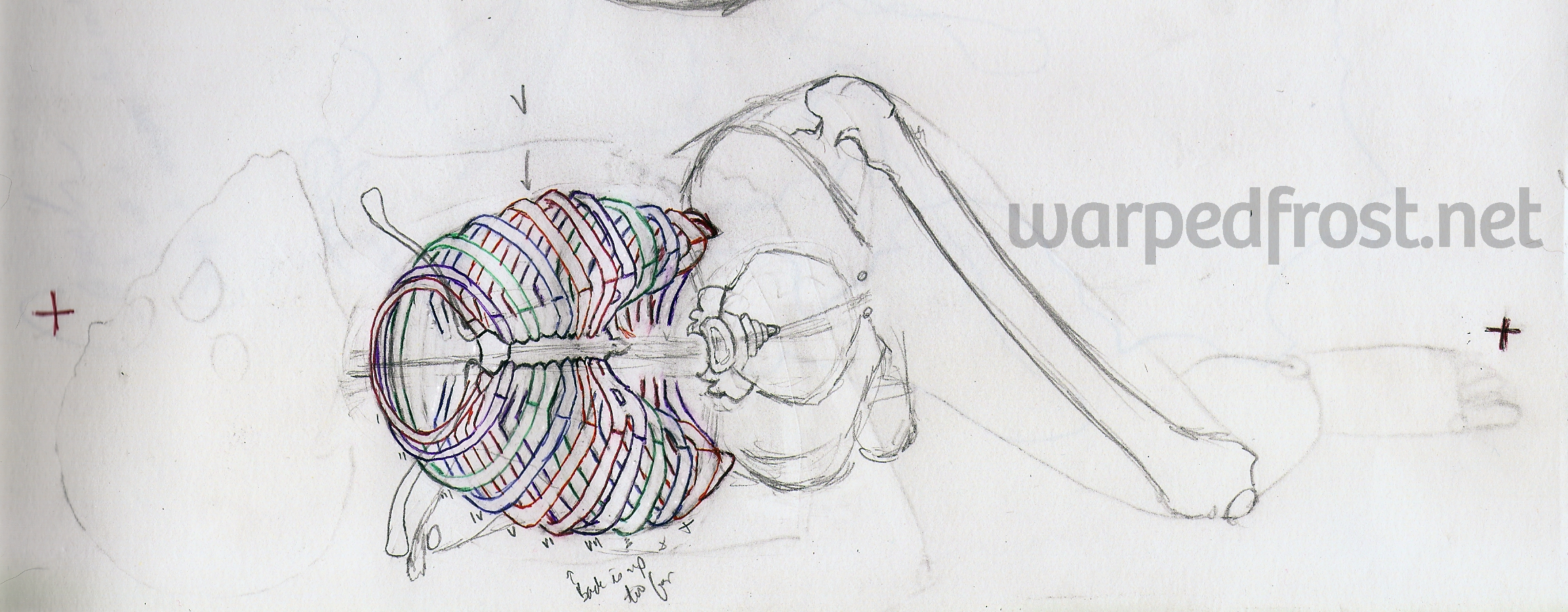
The assignment had been to do something you had never done before. I’d been thinking for years now that my figure drawings tend to always have the figure standing parallel to the picture plane, with foreshortening happening only sometimes in the limbs. This gives my figures a very stiff feel. So, I took this project as an opportunity to get a book one of my drawing professors had recommended a decade ago: John Cody’s Atlas of Foreshortening: The Human Figure in Deep Perspective. It consists entirely of photos of two nude models, one man and one woman, with each pose photographed from several different angles to create different degrees of foreshortening.
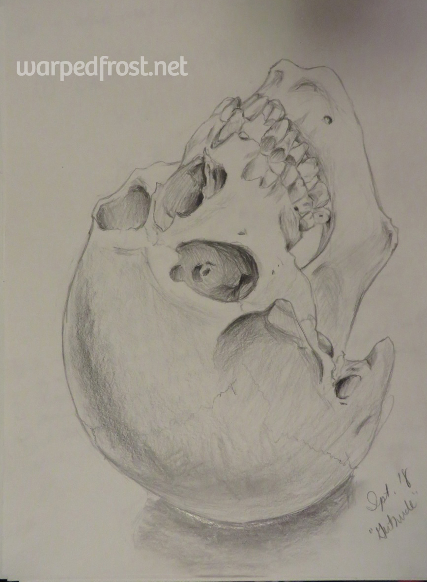
However, my ultimate goal was to draw a skeleton in the pose I picked, so that required a thorough review of anatomy to be able to piece the living model’s skeleton together from what surface landmarks were visible in her photo.
Going into this project, I didn’t realize just how masochistic that task was. I love the study of anatomy, but it had been 10 years since I studied it in-depth, not to mention it had been 10 years since I last put brush to canvas, or even spent a considerable amount of time making art period. What perhaps made things most difficult of all was that in what few painting classes I’d had, drawing on the canvas with pencil was absolutely forbidden, and that rule had stayed with me. I’m a far better drawer than I am a painter, so this was a serious handicap to work with given the complexity of the subject I’d chosen.
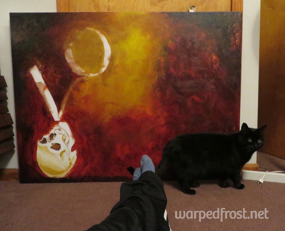
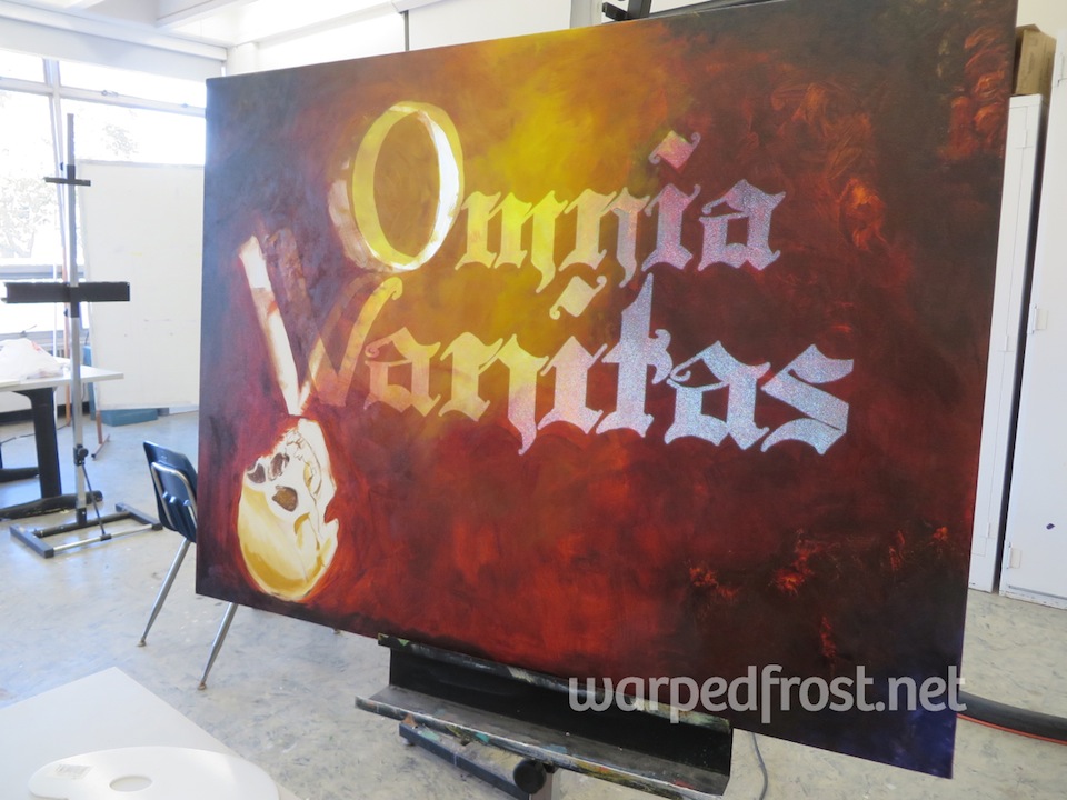
After doing a few sketches and the above study, I proceeded to try to paint this beast putting down only division lines and freehanding the lettering. This turned out horrible and I ended up painting over everything I’d done (about three class periods’ worth of work plus some painting done at home). My prof suggested I project my lettering and drawing onto the canvas, and while that initially felt like cheating to me, I knew I wasn’t going to be able to create what I wanted to at my current skill level without resorting to that. It feels a bit silly to say it now, but I truly felt guilty about tracing the lettering and eventually the skeleton unto the canvas even though I was tracing something I’d drawn myself!

Stephen Peck’s Atlas of Human Anatomy for the Artist was my best friend while painting this. I have some snazzier anatomy books, but as a drawer first and foremost, this classic text with photos and detailed drawings is still my favorite.
While projection made getting the letters and the skeleton unto the canvas easy, coloring was still an issue. The color cast on the skeleton from the imaginary light source and nebulous background is one of the things in this painting that I’m not fully satisfied with. Otherwise, I’m happy with the way this painting turned out, and with the fact that it was not only exhibited at Wayne State’s Art Education & Art Therapy show, but also chosen for the postcards used to promote said exhibit.


☆
BONUS!

